Kastle Visual Language
& Brand System
Overview
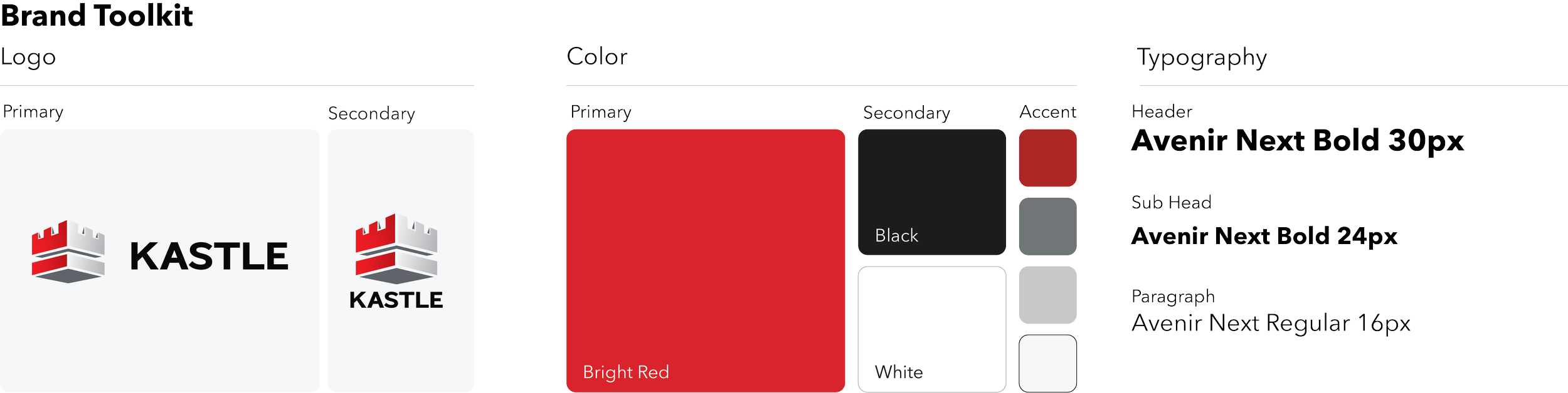
The brand had strong foundational guidelines but lacked the detailed visual rules needed to consistently apply them across digital experiences, marketing, video, and sales materials. As a result, teams were repeatedly making individual decisions around typography, imagery, UI treatments, layout, and other visual elements. I created a scalable visual language and reusable asset system that transformed those subjective decisions into repeatable design standards.
Visual principles
Simplify the complex
Security technology can be technical. Design should make products and services immediately understandable through clear hierarchy, concise messaging, diagrams, and focused visuals.
Show the experience first
Product imagery should communicate how technology fits naturally into everyday environments rather than presenting hardware in isolation whenever possible.
Build visual consistency across every environment
Photography and generated imagery use consistent lighting, composition, architecture, color treatment, and product presentation so different locations feel like part of one connected Kastle ecosystem.
Use brand color to direct attention
Kastle red is reserved for moments of emphasis—headlines, primary actions, important data, and brand signals—rather than becoming a decorative background color.