

Color Me Beautiful App
Overview
Color Me Beautiful is a cosmetics brand focused on helping customers find the most accurate makeup shades tailored to their unique features. Unlike many competitors, Color Me Beautiful prioritizes seasonal color analysis—a method that guides users in identifying their ideal makeup palette based on their personal coloring. The company aimed to translate this experience into a mobile app that mirrors and enhances their existing website, giving users a personalized and intuitive way to discover products that align with their seasonal profile.
Tools
Figma
Adobe Creative suite
My Role
Conceptualization
UX/UI Design Lead
Prototyping
Goal
Deliver a experience that creates a seamless experience where customers could identify their seasonal color, view compatible products, and shop—all in one place.
Duration
August 2020 - March 2021
Challenge
Customers needed a simple, mobile-friendly way to identify their seasonal color type, explore curated color palettes, and discover products that best match their unique profile.
Research
As a first step, we conducted in-depth research to better understand current customers and their shopping behaviors. These insights helped shape my approach to how users discover and purchase products.
User Research
The target audience was adults ages 18-70 who shop for makeup online.
Questions were asked to better understand users:
How often is seasonal colors important to determine makeup shade?
Opinions on competing color analysis and make up shade options?
Do any crossover shades options are optional?
Which platform is your preffered method of shopping

User Insights:
Efficiency: All users want to find their seasons and products to match seamlessly
Single location: Most users wanted the experience that they can seamlessly take their color quiz, learn their season, and see what products would work best for them in one single place.
48%
of customers didn’t know their seasonal color type, which created confusion and made it difficult for them to choose the right products.
30%
of customers expressed a desire for a tool they could access beyond the Color Me Beautiful website
80%
of customers expressed a strong preference for a mobile experience
Three user personas were created from interview insights.
Personas


To begin the design process, I conducted a competitive analysis of similar makeup and color analysis apps to understand industry standards, identify gaps, and uncover opportunities for differentiation.
The research revealed key gaps in existing solutions:
A lack of season-specific makeup recommendations
Reliance on external sites for palette results
The absence of a downloadable digital color palette.
Competitive Analysis

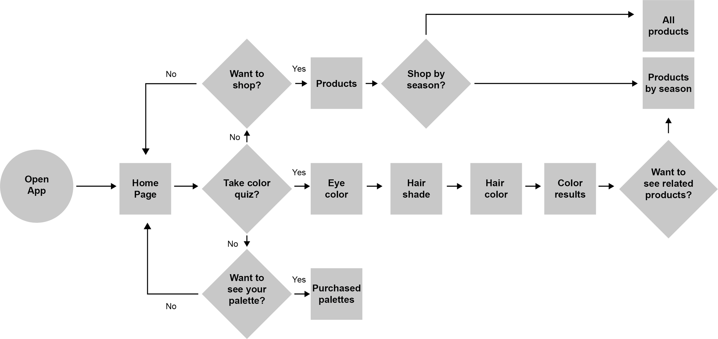
Before sketching individual screens, user flows were drawn up to track the personas progress throughout the application. With the personas' needs in mind, one flow was created to achieve the following goals:
Discover seasonal color
Find products most compatible
Purchase seasonal products / palletes
User Flow
Wireframes & Testing
I drafted low-fidelity wireframes then translated these into low-fidelity prototypes using Figma. Then tested them
Shopping
The home page hosts the “shopping page” where users can scroll and shop Color Me Beautiful products

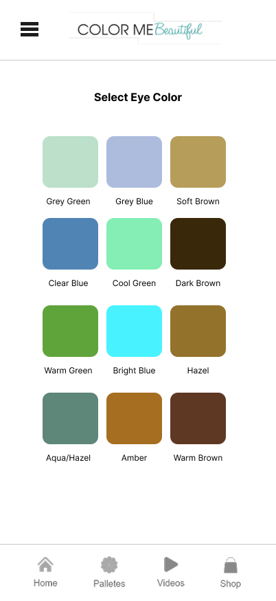
Color Quiz
The color quiz is accessible through a button on the home page
The experience guides users through a series of pages that lead them step-by-step through a personalized quiz


Color Palette
This screen is for displaying all the color swatches for a specific season
Shop by Season
Users can see our featured products for each season
This screen is most helpful after taking the color quiz

Remote usability tests were conducted using a improved high-fidelity clickable prototype in Figma. Results from these tests influenced changes to these features below.
Usability testing

Some users occasionally misclicked their selections and found it difficult to return to the previous screen. To address this, I added a prominently visible back arrow to improve navigation and reduce user frustration.


Users suggested having the option to download their color swatches for offline access. In response, I added a download button to enable users to easily save and reference their palettes anytime, even without an internet connection.


Users suggested adding the option to download their color swatches for offline access, so they could refer to them even without an internet connection. In response, we incorporated a download button. Additionally, users recommended increasing the spacing between swatch rows to improve readability and touch accuracy, which we also implemented.
Final Design


Final Thoughts and Outcome
Customers reported higher satisfaction and confidence knowing they were selecting products tailored to their seasonal color profile. By guiding users through a personalized discovery process and clearly revealing their season, the app expanded their product options—not only within Color Me Beautiful’s offerings but also with complementary products from other brands. This enhanced user confidence contributed to increased website traffic and greater overall customer engagement.
18.9k
Impressions
$13.4
proceeds per paying user on app
(weekly average)
+15%
increase in sales in season specific products
-
![An image of the Cultural Center.]()
01
-
![An image of the Cultural Center.]()
02
-
![An image of the Cultural Center.]()
03


