Building a visual identity that makes healthcare feel more accessible.
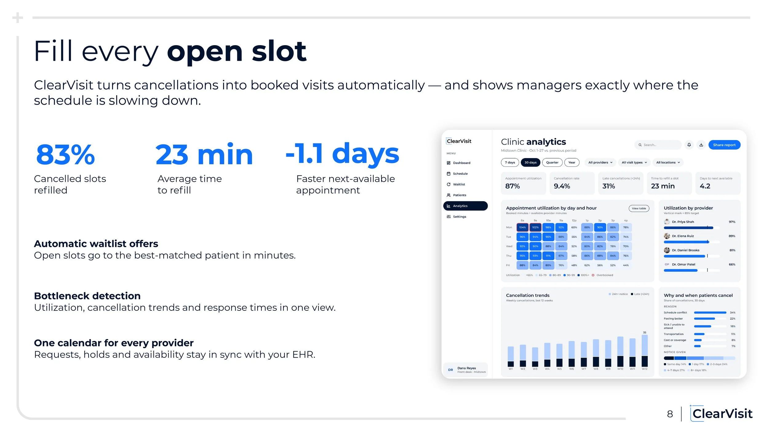
ClearVisit is a healthcare scheduling platform designed to connect patients with care while helping clinics manage appointments more efficiently. The brand identity was developed to communicate clarity, trust, and approachability, creating a consistent experience across consumer and enterprise touchpoints.

The Challenge
ClearVisit needed a visual identity that balanced the trust and professionalism expected from a healthcare platform with the simplicity and approachability of a modern consumer app.
The challenge was to create a recognizable brand that felt welcoming to patients while remaining credible and functional for healthcare professionals, with a visual system flexible enough to scale across mobile, desktop, and marketing applications.
Brand positioning & creative direction

Clarity
Simple layouts, clear hierarchy, minimal distractions.

Trust
Consistent typography, predictable patterns, professional tone.

Approachability
Welcoming imagery, accessible language, balanced use of color.

Modernity
Contemporary typography, flexible components, digital-first applications.
Logo design
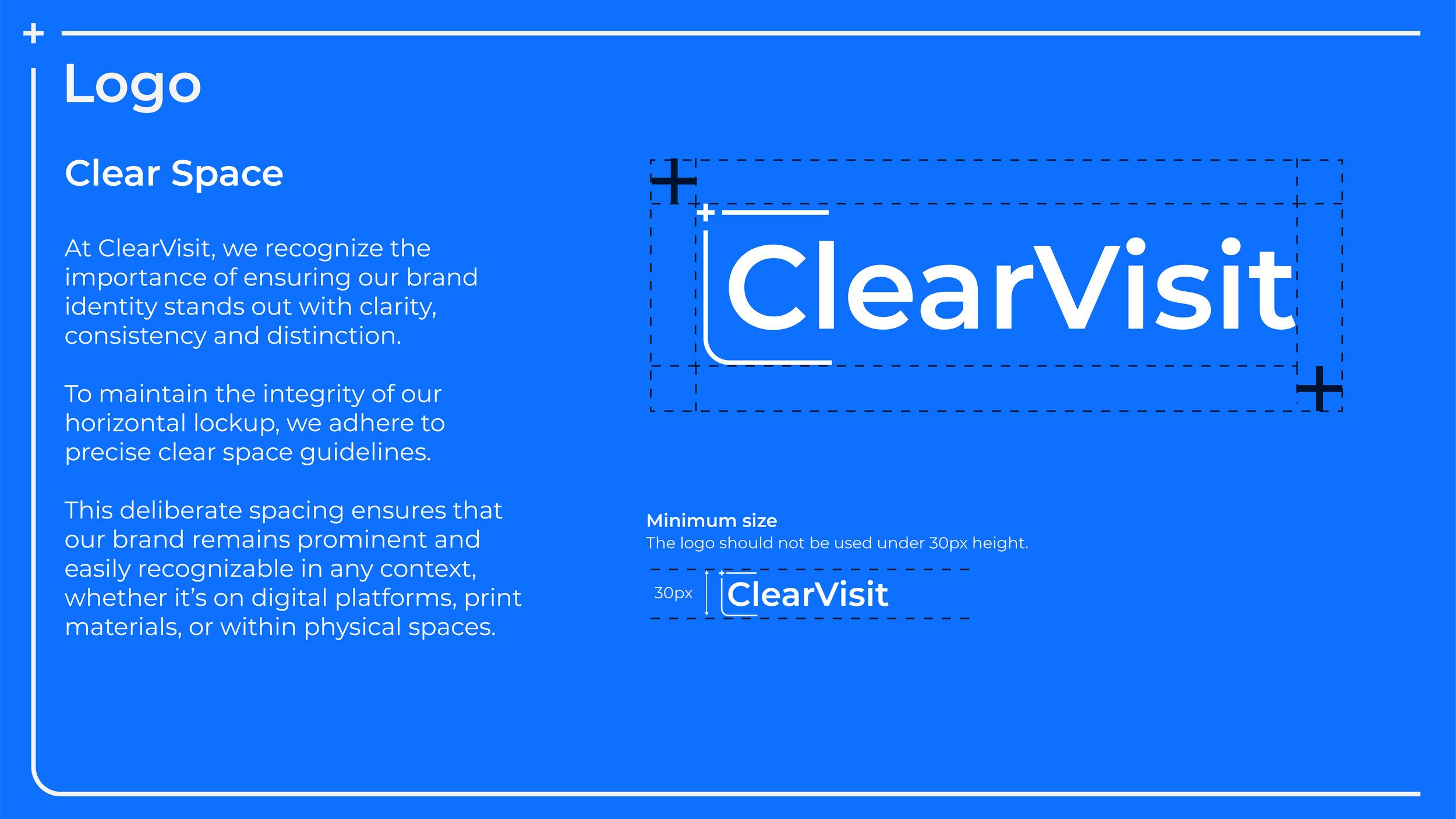
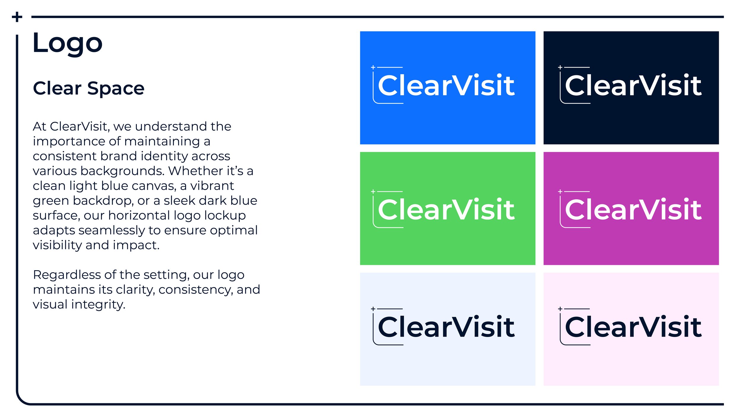
The ClearVisit logo was designed to visually communicate the application's core purpose: bringing clarity, convenience, and flexibility to healthcare scheduling.
The intentional break in the symbol represents a clear view forward, reflecting the application's ability to simplify the process of finding and managing healthcare appointments. Its geometric form draws inspiration from a calendar, reinforcing the idea of scheduling flexibility and giving users greater control over their time.
The plus sign serves a dual purpose. It represents the action of adding appointments to a personal schedule while also subtly referencing the medical cross, establishing an immediate connection to the healthcare industry.
Together, these elements create a simple, purposeful identity that reflects ClearVisit's mission to make healthcare scheduling more accessible and intuitive.

Color Palette
ClearVisit’s color palette was developed to communicate trust, clarity, and approachability. The balance of calming colors and clean neutrals creates a welcoming healthcare experience while maintaining the contrast and visual hierarchy needed for an intuitive, accessible interface.
Typography
ClearVisit’s typography was selected to balance modern simplicity with readability and professionalism. A clear, consistent type hierarchy makes information easy to navigate across both the patient-facing mobile app and clinic management dashboard, reinforcing the brand’s focus on accessibility and ease of use.
Iconography
ClearVisit’s iconography was designed to communicate functionality through simple, recognizable visuals. Consistent line weights, balanced proportions, and minimal detailing create a cohesive visual language that improves navigation and usability across both the mobile app and desktop dashboard.
Photography
ClearVisit’s photography emphasizes authenticity, warmth, and approachability through natural lighting, neutral tones, and modern healthcare environments. The imagery focuses on genuine human interactions and welcoming spaces, helping establish trust while making the healthcare experience feel more personal and accessible.



Brand in action